Type Styles

Share your Style

Please choose your preferred type styles for your adoption profile book and fill in your style sheet form located in our shared Dropbox folder! Keep in mind, these are not templates for you to select from, but rather, the beginning of a conversation about what your font choices will look like.
ClassicType+copy.png

Type Style 1

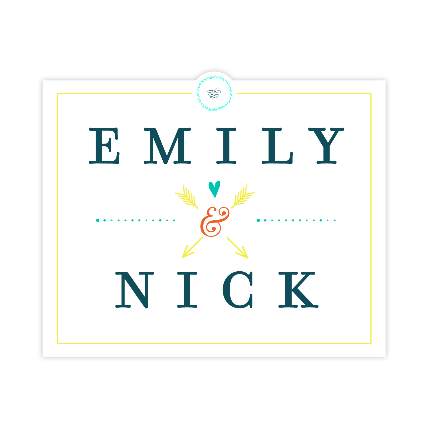
Framing your headings can be a dynamic element in your profile. You can easily "pop" photos out with cutouts and add bright elements like we did in this example. The style here is formal and orderly but manages to be playful, too. We think it wraps almost all the creative styles into one cohesive look!

TYPE STYLE 2

Your desire for a font that's really easy to read doesn't mean it has to be boring! This mix of weights and caps on a modern serif font is both fun and easy to read.

TYPE STYLE 3

Who says simple has to be dull? In this sample it's the utter simplicity that is utterly gorgeous. The differing weight of the fonts and border give just the right contrast to the fonts and make it bold rather than plain. Don't you agree?

TYPE STYLE 4

This type treatment is clean, sophisticated, and leans to the formal while still being welcoming and modern. It's expressive but understated. We added some modern but sleek glyphs to balance the formality of the fonts.

TYPE STYLE 5

Personality plus! The font is very modern but still playful. Even through there are many different elements at play here they work together beautifully to express the charm of the adoptive parents. We love changing things up with rotated type!

ModernType_Shape.png

TYPE STYLE 6

Bringing headings inside an icon or badge is a great way to make them stand out! In this case we pair a modern font that is simple with a strong geometric shape.

HanddrawnType2 copy.png

TYPE STYLE 7

Fun and BOLD! This typography sample is a great fit for the relaxed and conversational profile style. Doesn't it make you want to meet Iliana and Enrique?

SerifType1.png

TYPE STYLE 8

Traditional but still like a little flair? This great combination of font styles includes the use of an elegant ampersand and a linear flourish to add a little extra design punch.

HandDrawnType.png

TYPE STYLE 9

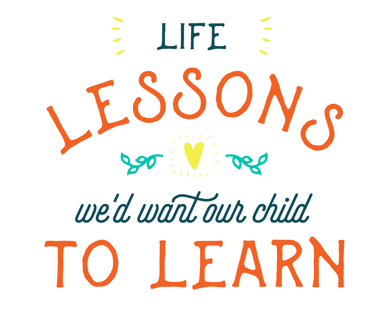
This seriously fun type feels extra whimsical. The combination of fonts and graphic elements showcases creativity and a cheery personality.

ElegantType.png

TYPE STYLE 10

Elegant, soft, and sophisticated describes this type-style perfectly. An understated ampersand keeps it modern, and the graceful curve of the letters are pleasing to the eye.

CondensedType.png

TYPE STYLE 11

Condensed fonts are high-impact but still clean looking. They maintain a minimal style but add a cool punch to the profile. They help conserve space in your headings as well, so your photos can be the star of the show!

ModernType_Circle (1).png

TYPE STYLE 12

This style feels familiar and stable. The perfect roundness of the circle element is pleasing to the eye and can add depth to the layout. Paired here with simple, clean fonts- it feels straight-forward but dynamic.

Previous
Previous

Page Layout Styles

Next
Next

Light Colors